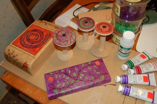
 After exploring many bad options, the folks at Nevada Fine Arts introduced me to something called matte medium. I also learned that depending on the color, artists' acrylics come in transparent, semi-transparent, or opaque. Matte medium is a transparent base that can be mixed with the acrylic paint to spread out the pigment molecules without thinning the consistancy. The more matte medium you add, the more transparent a color you get, especially if you start with a paint that is already listed as transparent.
 My first experiment was a total bust. I didn't add enough medium and I ended up with an evil dark, almost opaque, purple. Hopefully noone will look at the bottom of my bobbin-rack-to-be. After that I went to town, using about 70% medium. That mix allows the burn lines to show through nicely. The only limitation is that the paint doesn't go on very evenly. You can see this in the purple piece. I am preferring to think of this as a folksy look. Leaving off the paint would accomplish a more refined product, but my aim is to get something more outrageous than refined.
Tomorrow I buy a lot more medium and some additional colors.

1 comment:
I like the prototype - the patterns and colors work well. Think of varigation in color application as part of the pattern.
Post a Comment